
- Home
- Ecommerce Conversion Rate Optimization: The Complete Guide With a Priority Checklist
Ecommerce Conversion Rate Optimization: The Complete Guide With a Priority Checklist
Ecommerce conversion rate optimization, or CRO, is the practice of increasing the percentage of store visitors who complete a purchase. It relies on tracking, customer research, testing, and repeated improvement rather than changing random parts of a website and hoping sales go up.
The difficulty is rarely finding CRO ideas.
Search for ways to increase an e-commerce conversion rate, and you will find hundreds of them. Add more reviews. Change the button. Offer free shipping. Rewrite the product description. Add urgency. Simplify checkout. Improve the photography.
Any one of those ideas might help.
Trying to do all of them at once usually does not.
The real question is not, “What could we change?”
It is, “Which change is most likely to matter on this store, at this point in the customer journey, with the traffic and resources we have?”
This guide will help you answer that question.
What Is Ecommerce Conversion Rate Optimization?
Ecommerce conversion rate optimization is the structured process of improving an online store so that more visitors complete valuable actions.
The final purchase is the most important conversion, but it is not the only one worth tracking.
A customer may move through several smaller conversions first:
- Viewing a product
- Using a filter
- Selecting a variant
- Adding an item to the cart
- Beginning checkout
- Entering payment information
- Completing an order
- Returning for another purchase
Looking only at the final conversion rate tells you whether the store has a problem.
Looking at each step tells you where the problem is.
That is the difference between basic reporting and useful CRO.
Digital Shaping’s conversion rate optimization services use behavioral analysis, funnel reviews, testing, and user experience improvements to identify the points where visitors hesitate or leave. The objective is not simply to generate more clicks. It is to create more revenue from the attention the store already receives.
How to Calculate Your Ecommerce Conversion Rate
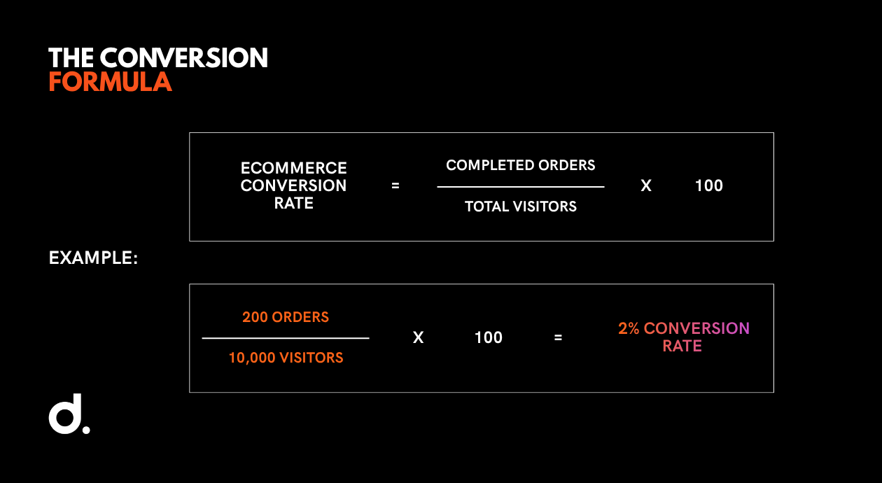
The basic formula is:
Ecommerce conversion rate = completed orders ÷ total visitors × 100
For example, suppose your store receives 10,000 visitors in one month and records 200 completed orders.
200 ÷ 10,000 × 100 = 2%
Your ecommerce conversion rate for that month is 2%.
You can apply the same calculation to individual funnel stages.
If 1,000 people view a product and 120 add it to their carts:
120 ÷ 1,000 × 100 = 12% product-view-to-cart rate
If 120 people add an item to the cart and 60 begin checkout:
60 ÷ 120 × 100 = 50% cart-to-checkout rate
If 60 begin checkout and 30 complete the purchase:
30 ÷ 60 × 100 = 50% checkout completion rate
This breakdown is far more useful than the overall 3% purchase rate alone.
It tells you where to look.
What Is a Good Ecommerce Conversion Rate?
There is no single ecommerce conversion rate that every store should aim for.
The right benchmark depends on:
- Product category
- Average order value
- Purchase frequency
- Mobile and desktop traffic mix
- Paid, organic, email, social, and direct traffic
- New versus returning customers
- Geographic market
- Brand familiarity
- Promotion and discount activity
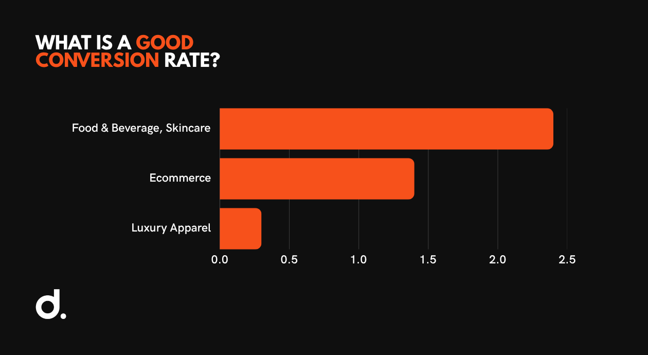
Statista’s first-quarter 2026 dataset reported an average conversion rate of 1.4% across the ecommerce verticals it tracked. Food and beverage and skincare reached 2.4%, while luxury apparel and accessories were reported at 0.3%. Those differences are not necessarily signs that one sector is better at CRO. A low-cost repeat purchase naturally behaves differently from a considered luxury purchase.
Treat external benchmarks as context.
Your most useful benchmarks are often internal:
- This quarter compared with last quarter
- Mobile compared with desktop
- New customers compared with returning customers
- Paid traffic compared with email traffic
- Full-price periods compared with promotional periods
- One product category compared with another
A store converting at 1.8% may be growing profitably.
Another store converting at 4% may be relying on constant discounting, attracting low-value customers, and losing money after returns.
Conversion rate matters.
Revenue, margin, repeat purchase rate, and customer acquisition cost matter too.
The Ecommerce CRO Process: Track, Research, Test, Improve
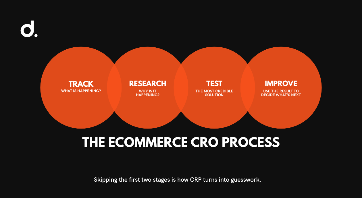
A reliable ecommerce CRO process has four stages:
- Track what is happening.
- Research why it is happening.
- Test the most credible solution.
- Use the result to decide what comes next.
Skipping the first two stages is how CRO turns into guesswork.
Step 1: Set Up Ecommerce Analytics Tracking
Before changing anything, make sure you can see how shoppers move through the store.
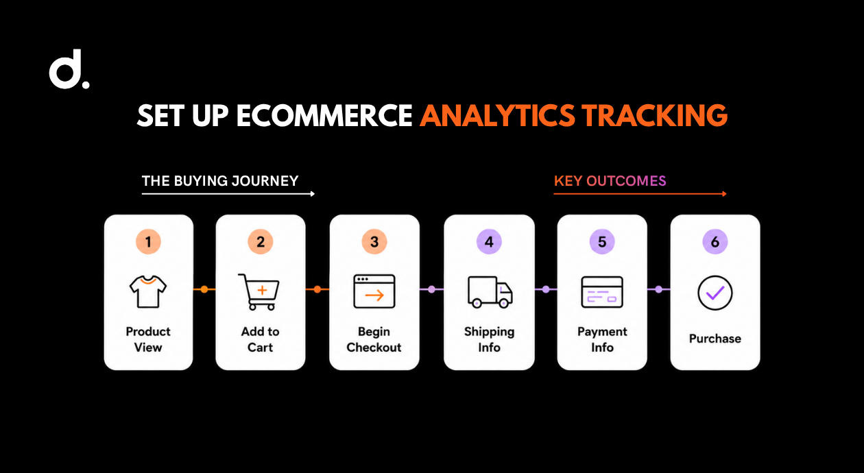
At a minimum, track:
- Product-list views
- Product-page views
- Search use
- Filter use
- Add-to-cart actions
- Cart views
- Checkout starts
- Shipping information
- Payment information
- Purchases
- Revenue
- Refunds
- Average order value
Google Analytics 4 recommends ecommerce events including view_item, add_to_cart, view_cart, begin_checkout, add_shipping_info, add_payment_info, purchase, and refund. Using Google’s recommended names makes it easier to populate ecommerce reports and compare movement through the shopping journey.
Once the events are working, build a GA4 Funnel Exploration for the main buying path.
A simple version might be:
Product view → Add to cart → Begin checkout → Purchase
You can then break the funnel down by:
- Device
- Browser
- Traffic source
- Country
- New or returning user
- Product category
- Campaign
- Landing page
This matters because an overall conversion rate can hide a very specific problem.
Desktop checkout might work well while mobile payment fails.
Email visitors might convert strongly while social traffic leaves immediately.
One product category may have a healthy add-to-cart rate while another receives views but almost no purchase intent.
CRO begins when the store stops treating all visitors as one group.
Step 2: Research the Cause of the Drop-Off
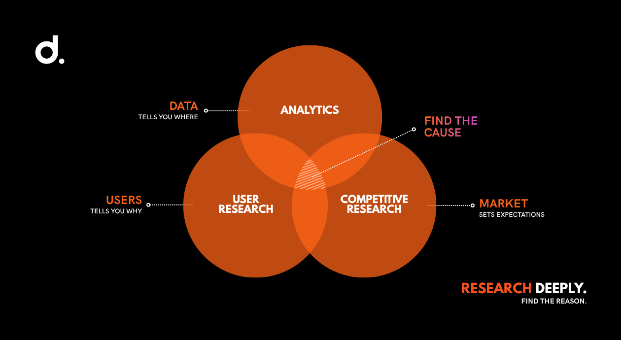
Analytics shows where people leave.
It does not always explain why.
That requires three forms of research.
Analytics research
Review your funnel data, page exits, device differences, search terms, product performance, checkout errors, returns, and support queries.
Look for patterns rather than isolated bad days.
Questions worth asking include:
- Which product pages receive traffic but few add-to-cart actions?
- Do mobile shoppers abandon more frequently?
- Does one payment method fail more often?
- Are users repeatedly searching for products they cannot find?
- Which pages have unusually high exits?
- Do high-traffic products also produce high returns?
- Are coupon users more likely to complete checkout?
- Where do returning customers behave differently?
Customer and usability research
Watch real people use the store.
Ask five suitable customers or target users to complete common tasks, such as:
- Find a product for a specific need.
- Compare two items.
- Determine whether a product is suitable.
- Find shipping and return information.
- Add a product and complete checkout.
- Edit or remove a cart item.
Do not guide them unless they are completely stuck.
Watch where they hesitate, misread labels, miss information, or take a path you did not expect.
Nielsen Norman Group’s well-known small-sample approach recommends testing with around five users in one round, fixing the issues discovered, and then testing again. The purpose is not to produce a statistically representative survey. It is to uncover obvious usability problems quickly and iteratively.
Also review:
- Customer-service conversations
- Live-chat transcripts
- Product reviews
- Return reasons
- Post-purchase surveys
- Cancellation notes
- On-site search queries
- Questions received through social media
Customers often tell you what is blocking conversions.
The information simply sits in a different system from the analytics dashboard.
Competitive and market research
Competitor research is useful when it helps you understand category expectations.
It should not become a copying exercise.
Review how established stores in your category handle:
- Navigation
- Filters
- Product imagery
- Size and fit information
- Delivery estimates
- Returns
- Reviews
- Checkout
- Payment options
- Bundles
- Subscriptions
Customers develop habits across the internet.
If nearly every familiar store places delivery details beside the purchase button, hiding yours inside a footer page creates unnecessary work.
Following a familiar convention can make the store easier to use.
Copying a competitor’s promotional banner because it looks successful is not research.
Step 3: Run a Valid Experiment
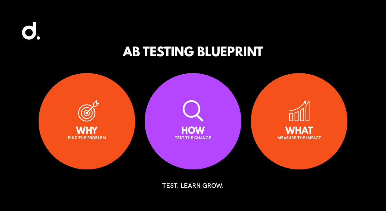
An A/B test compares two versions of an experience.
Version A is normally the existing page. Version B contains the proposed change.
Visitors are split between them, and the test measures whether the variation improves a predefined outcome.
Before starting, document:
- The problem you observed
- The evidence behind it
- The proposed change
- The primary success metric
- Any secondary or guardrail metrics
- The audience included
- The minimum test duration
- The decision rule
A useful hypothesis looks like this:
Mobile shoppers are abandoning the product page because the delivery estimate is hidden below several sections. Moving the estimate near the Add to Cart button will increase mobile add-to-cart rate without increasing cancellations.
That is testable.
“Let’s make the page more engaging” is not.
Do not stop a test because one version moves ahead after two days.
A result can look promising and still be caused by random variation. Optimizely defines statistical significance as an indication of how unusual the observed difference would be if the original and variation were actually performing the same. Its platform waits for minimum visitor and conversion criteria before declaring significance.
Also watch for trade-offs.
A discount banner may increase orders but reduce gross margin.
An aggressive urgency message may increase first purchases but harm trust.
A simplified product page may increase add-to-cart activity while causing more returns because important information was removed.
The winning version is not always the one with the highest conversion rate.
It is the one that creates the strongest overall business result.
Step 4: Use the Result and Continue
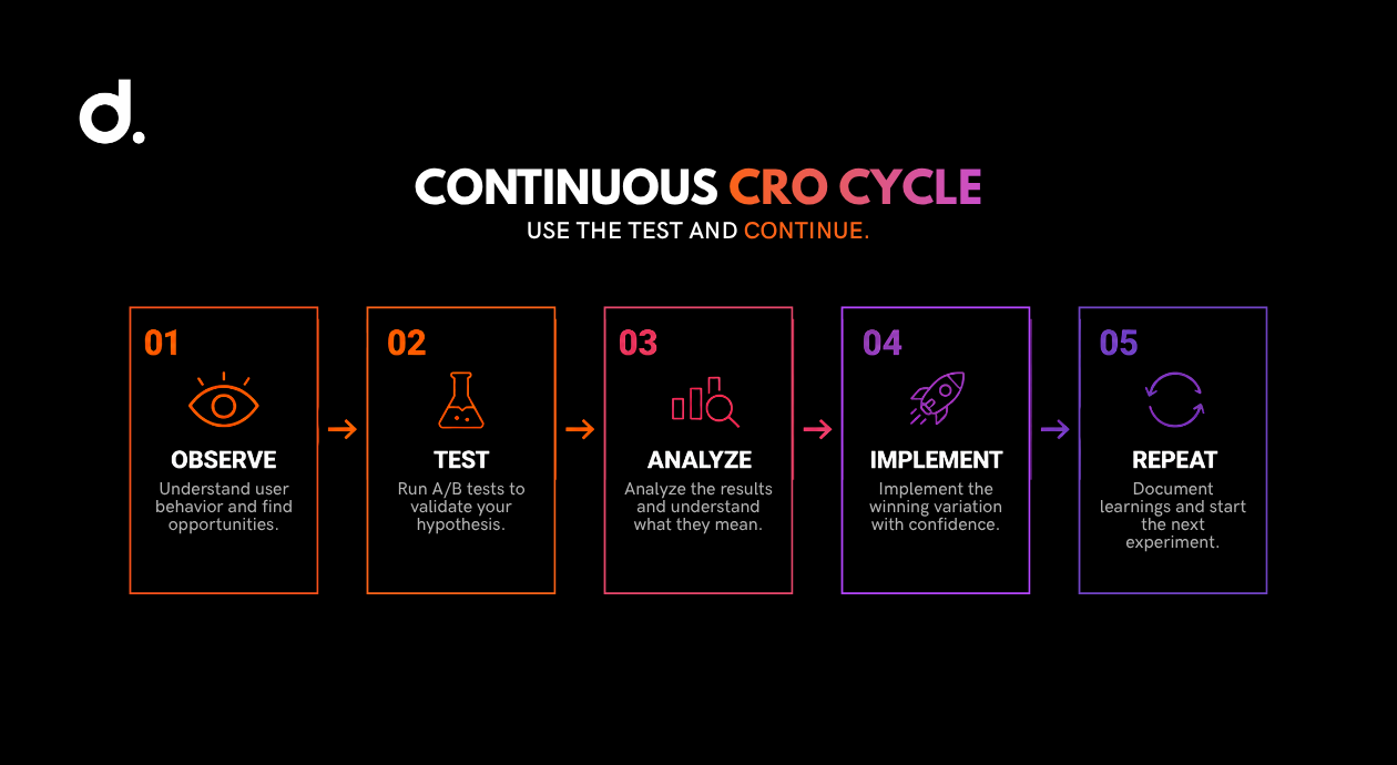
CRO is not a one-time website cleanup.
A test can:
- Confirm the hypothesis
- Disprove it
- Produce no meaningful difference
- Improve one metric while harming another
- Reveal a new problem worth investigating
All five outcomes teach you something.
Record what happened, why you think it happened, and what the result changes about your next decision.
Over time, this creates a research library specific to your customers.
That is far more valuable than a folder of generic CRO tips.
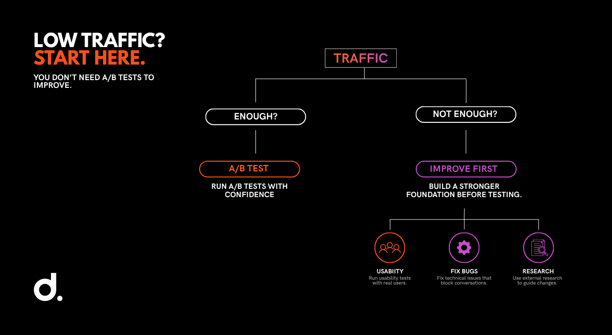
Do You Have Enough Traffic to Run an A/B Test?
An A/B test needs enough visitors and conversions to separate a real effect from normal fluctuation.
A low-traffic store may split a small number of visitors between two versions and wait months for a conclusive answer.
During that time:
- The traffic mix may change.
- A promotion may start or end.
- A product may go out of stock.
- Seasonality may affect demand.
- Prices or shipping terms may change.
- The test may never collect enough conversions.
There is no universal traffic threshold because sample size depends on:
- Current conversion rate
- Expected improvement
- Desired confidence
- Number of variations
- Daily traffic
- Number of conversions
- Test design
Use a reputable A/B test sample-size calculator before starting.
The smaller the improvement you want to detect, the more data you usually need.
A store may have enough traffic to test a site-wide shipping message but not enough to test a small change on one low-volume product page.
What to Do When Traffic Is Too Low
Low traffic does not mean you cannot improve conversion.
It means formal A/B testing may not be the best first tool.
Use these alternatives.
Run usability tests
Five well-chosen users struggling with the same checkout field is useful evidence.
You do not need 100,000 monthly visitors to observe confusion.
Fix clear technical problems
A broken mobile menu, failed payment button, missing image, incorrect price, or unreadable form does not need an A/B test.
Repair it.
Use strong external research
Research from organizations such as Baymard Institute and Nielsen Norman Group can support changes where your store lacks enough traffic for a formal test.
External research cannot tell you exactly how your audience will behave, but it is better than a random preference.
Compare longer periods carefully
A before-and-after comparison is weaker than a controlled test because many factors can change between periods.
It can still be useful when you account for:
- Seasonality
- Promotions
- Traffic-source changes
- Inventory
- Pricing
- Device mix
- New versus returning customers
Focus on large, high-confidence problems
A small store should not spend six months testing whether a button should be dark blue or black.
Start with issues likely to affect the buying decision:
- Missing delivery information
- Weak product imagery
- Confusing size selection
- Forced account creation
- Unexpected charges
- Broken mobile checkout
- Missing payment options
- Poor search and filtering
Low traffic is a reason to prioritize more carefully, not a reason to stop improving the store.
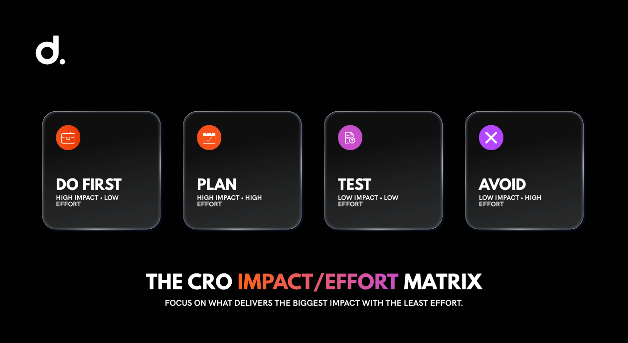
The CRO Impact/Effort Matrix: What Should You Fix First?
The Impact/Effort Matrix helps you rank CRO ideas according to two questions:
- How much could this change improve the customer journey or business result?
- How difficult will it be to research, build, launch, and maintain?
Score each proposed change as low or high impact, then low or high effort.
| Impact | Low effort | High effort |
|---|---|---|
| High impact | Do first | Plan carefully |
| Low impact | Test when convenient | Usually avoid |
High Impact, Low Effort: Do These First
These are the best starting points.
Examples may include:
- Making the free-shipping threshold visible
- Adding a guest-checkout option
- Clarifying delivery dates
- Marking optional form fields
- Fixing a broken mobile CTA
- Adding an FAQ beside a high-friction product
- Displaying reviews near the purchase decision
- Hiding the coupon field behind a link
- Clarifying the returns policy
These changes are not automatically high impact for every store.
Your analytics and customer research should support the classification.
High Impact, High Effort: Plan and Resource Them
These changes may create a meaningful improvement but require more work.
Examples include:
- Redesigning checkout
- Rebuilding site navigation
- Reorganizing product categories
- Reshooting an entire product catalog
- Replacing search technology
- Adding personalization
- Migrating ecommerce platforms
- Introducing a new subscription model
Do not rush these changes simply because the potential return is large.
Research them properly. Break them into smaller stages where possible.
Low Impact, Low Effort: Use Carefully
These ideas are easy to launch but unlikely to solve a major problem.
Examples include:
- Small wording changes with no evidence
- Decorative icon changes
- Minor spacing adjustments
- Changing a button color when visibility is already strong
- Adding another promotional badge to a crowded page
There is nothing wrong with testing smaller details when the main journey is already healthy and the store has enough traffic.
They should not distract from larger leaks.
Low Impact, High Effort: Avoid for Now
This is where ecommerce teams lose time.
Examples include:
- Rebuilding navigation without research
- Adding complicated technology because a competitor uses it
- Creating a personalization engine before basic segmentation works
- Redesigning the homepage when checkout is the real problem
- Producing hundreds of new images before identifying which products need them
Before approving any CRO project, place it inside the matrix.
If it takes significant effort and you cannot explain the expected customer or business impact, it is not ready.
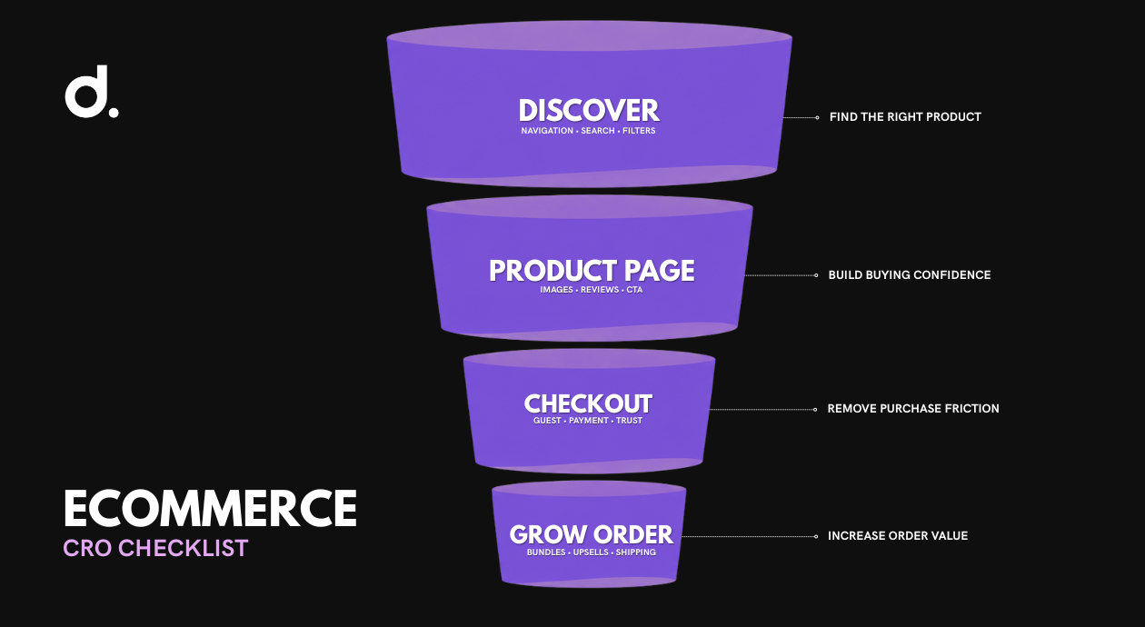
Ecommerce CRO Checklist by Funnel Stage
Use this checklist to identify potential improvements.
Do not treat it as a requirement to change everything.
Create a shortlist based on your evidence, then move each item into the Impact/Effort Matrix.
Stage 1: Help Shoppers Find the Right Product
Review navigation
Your navigation should reflect how customers shop, not how your inventory system is organized.
Check whether:
- Categories use familiar customer language.
- Popular categories are easy to reach.
- Mobile navigation is manageable.
- Products do not appear in surprising categories.
- Important subcategories are not buried.
- The customer can return to a previous list easily.
Improve site search
Test common searches, misspellings, model numbers, product attributes, and customer language.
Search should handle:
- Singular and plural terms
- Common spelling mistakes
- Synonyms
- Product codes
- Colour and size terms
- Category searches
- Out-of-stock products
- No-results pages
A no-results page should help the customer recover through alternatives, categories, or support.
It should not be a dead end.
Make filters useful
Filters should help customers narrow a large choice set.
Review:
- Size
- Price
- Colour
- Material
- Brand
- Compatibility
- Rating
- Availability
- Delivery speed
- Product-specific attributes
Do not add filters simply because the data exists.
Prioritize the attributes customers genuinely use to compare.
Improve product-listing cards
A category page should provide enough information for shoppers to decide which products deserve a closer look.
Consider displaying:
- Clear product name
- Price
- Discount context
- Rating
- Review count
- Variant availability
- Key attribute
- Secondary image
- Stock or delivery message
Digital Shaping’s ecommerce SEO services connect product and category visibility with product-page structure, technical performance, user intent, and internal navigation. CRO and ecommerce SEO should support the same journey: attract the right shopper, then help that shopper move forward.
Stage 2: Improve Product Page Conversion
Strengthen product photography
Online customers cannot touch, hold, try, or inspect the item.
The images have to close that gap.
Baymard’s product-page research found that 56% of test participants began exploring product images as their first action after reaching a product page. Its benchmark also found that 25% of ecommerce sites did not provide sufficient image resolution or zoom for proper evaluation.
Depending on the product, provide:
- Front, back, and side views
- Close-ups
- Zoom
- Product in use
- Product shown to scale
- Packaging
- Included accessories
- Material and texture details
- Human models for wearable products
- Video where movement matters
Image quantity alone is not enough.
Every image should answer a buying question.
Rewrite vague product descriptions
A useful product description helps someone decide whether the item is right for them.
Cover:
- Who it is for
- The problem it solves
- Main benefits
- Materials or ingredients
- Dimensions
- Compatibility
- Care instructions
- What is included
- Limitations
- Delivery and returns
Do not copy the manufacturer’s description and assume it is sufficient.
Connect specifications to their practical meaning.
Instead of:
10,000 mAh battery.
Try:
The 10,000 mAh battery provides enough capacity for multiple phone charges, making it suitable for travel or long days away from a power outlet.
The specification builds credibility.
The explanation builds relevance.
Make variants easy to understand
Customers should immediately know:
- Which variants are available
- Which are out of stock
- What has been selected
- Whether the price changes
- How colour names relate to the images
- Which size is likely to fit
- When unavailable options may return
Do not allow someone to reach checkout before discovering that the chosen variant is unavailable.
Put delivery and returns near the decision
Do not hide essential purchase conditions inside separate policy pages.
Near the Add to Cart button, show:
- Estimated delivery
- Shipping cost or threshold
- Returns window
- Key exclusions
- Stock status
- Dispatch timing
Customers may still open the full policies.
The product page should answer the immediate questions first.
Add credible reviews and proof
Display reviews where they support the decision.
Useful review systems allow customers to:
- Filter by rating
- Search review text
- View verified purchases
- See customer photos
- Sort by recent or helpful
- Review product-specific attributes
- Understand how the company responds to problems
A row of perfect five-star icons with no detail can look less credible than a varied set of specific reviews.
Improve the main call to action
The Add to Cart button should:
- Be visually clear
- Use direct wording
- Show the selected state
- Work consistently on mobile
- Provide feedback after it is clicked
- Remain near key purchase information
Do not solve every CTA problem by making the button larger.
First make sure the customer has enough confidence to click it.
Stage 3: Reduce Cart and Checkout Abandonment
Baymard’s 2026 cart-abandonment research reports an average documented abandonment rate of 70.22% across 50 studies. Some abandonment is normal browsing. Among shoppers who abandoned for reasons other than “just browsing,” common causes included high additional costs, slow delivery, lack of trust, forced account creation, and a long or complicated checkout.
Show the full cost early
Unexpected charges create a sharp break in trust.
Show or help shoppers estimate:
- Shipping
- Tax
- Service fees
- Duties
- Minimum order amounts
- Subscription terms
The final checkout total should not feel like new information.
Offer guest checkout
Do not force a first-time customer to create an account before buying.
Allow the person to complete the order, then offer account creation after the purchase using the information already entered.
Baymard’s 2026 research found that 18% of surveyed US shoppers had abandoned because a site required account creation.
Reduce unnecessary fields
Every field creates another decision, typing task, and opportunity for an error.
Remove fields that are not required for:
- Payment
- Delivery
- Legal compliance
- Essential order fulfilment
Baymard reports that the average US checkout shows 23.48 form elements by default, while an ideal flow can often be reduced to 12 to 14.
Mark required and optional fields clearly
Do not make users guess.
Baymard’s checkout testing found that failing to identify both required and optional fields led to confusion, validation errors, and abandonment. Its benchmark found that only 14% of desktop checkouts clearly marked both.
Use labels such as:
- Email address *
- Company name (optional)
- Apartment or suite (optional)
Keep labels visible after the customer begins typing.
Hide the coupon field behind a link
A large empty promo-code box can make a full-price customer feel they are missing a better deal.
Use a smaller link such as:
Have a promo code?
Open the field after it is selected.
Support familiar payment methods
Offer payment options appropriate for your market and audience.
That may include:
- Major credit and debit cards
- Digital wallets
- PayPal
- Buy now, pay later
- Local payment methods
More options are not always better.
Provide the options customers expect without making checkout feel chaotic.
Make errors easy to fix
A checkout error should explain:
- What went wrong
- Where it happened
- How to fix it
- Whether entered information has been retained
Do not clear the entire form because one field failed.
Show progress when checkout has several stages
A simple indicator such as:
Information → Delivery → Payment
helps customers understand where they are and what remains.
Do not create extra pages merely to make the process appear structured.
The goal is clarity, not more steps.
Test checkout on real devices
Test:
- iPhone and Android
- Common screen sizes
- Safari and Chrome
- Autofill
- Password managers
- Digital wallets
- Slow mobile connections
- Failed payments
- Address errors
- Cart editing
- Discount codes
A checkout can look correct in a design file and still fail in use.
Digital Shaping’s website speed optimization service addresses performance issues that can interrupt browsing and checkout, particularly on mobile connections.
Stage 4: Increase Average Order Value Without Creating Friction
Average order value should grow because the additional purchase is useful.
Not because the store made the original purchase harder to complete.
Use a clear free-shipping threshold
Show the threshold early.
As the shopper adds items, display the remaining amount:
You are $12 away from free shipping.
Make sure the threshold is commercially sustainable.
Offer relevant add-ons
Recommend products that make sense with the selected item.
Examples include:
- Accessories
- Refills
- Protective cases
- Compatible products
- Gift packaging
- Extended sizes
- Installation items
Do not show the same generic recommendations for every product.
Build useful bundles
A bundle should solve a clearer problem than the individual items alone.
For example:
- Starter kit
- Travel set
- Complete routine
- Replacement bundle
- Gift set
- Professional package
Explain what is included and what the customer saves.
Keep checkout recommendations restrained
Checkout is not the place for endless browsing.
Use one or two simple, low-risk suggestions that do not interrupt completion.
Stage 5: Recover Abandoned Carts and Improve Repeat Conversion
CRO does not end when the shopper leaves or buys.
Set up an abandoned-cart flow
Send a useful reminder while the purchase is still relevant.
Klaviyo’s 2026 guidance recommends sending the first abandoned-checkout message around two to four hours after checkout begins, followed by another message roughly 20 to 48 hours later. Klaviyo also notes that businesses should test timing for their own audience rather than treating one sequence as universal.
A practical sequence could include:
Email 1: Reminder and direct cart link
Email 2: Answers to common objections, delivery, returns, or product questions
Email 3: Alternatives, support, or a carefully considered incentive
Do not automatically offer a discount in the first email.
You may train customers to abandon carts deliberately.
Digital Shaping’s email marketing services include segmentation, automation, cart-recovery flows, testing, and performance analysis for ecommerce brands.
Improve the post-purchase experience
After purchase:
- Confirm the order clearly.
- Set delivery expectations.
- Provide tracking.
- Explain how to use or care for the product.
- Make support easy to reach.
- Ask for a review at an appropriate time.
- Recommend the next relevant purchase.
- Explain loyalty or replenishment options.
A confusing fulfilment experience harms future conversion even when the first order was successful.
Review returns as CRO data
Returns are not separate from conversion optimization.
A high conversion rate paired with a high return rate may signal:
- Misleading photography
- Weak sizing information
- Incomplete product descriptions
- Poor product quality
- Incorrect expectations
- Aggressive discounting
- Wrong audience targeting
A net sale is more valuable than a temporary order.
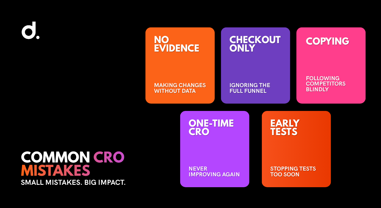
Common Ecommerce CRO Mistakes
Changing Things Without Evidence
“We prefer this version” is not customer research.
Tie each change to analytics, observed behaviour, customer feedback, or credible external evidence.
Calling Tests Too Early
Do not stop when a variation takes an early lead.
Define the decision rule before the test begins.
Testing Pages With Too Little Traffic
A test that cannot reach a useful sample will waste time and delay obvious improvements.
Use usability research or stronger evidence instead.
Running Overlapping Tests Carelessly
Several experiments affecting the same users and journey can make the result difficult to interpret.
Map concurrent tests and isolate important changes where possible.
Copying Competitors
You can learn from conventions.
You cannot assume another store’s tactic works because it is visible.
You do not know:
- Why it was introduced
- Whether it performs well
- Which audience it targets
- Whether it is temporary
- Whether the company has tested it
Optimizing Only the Homepage
Many ecommerce visitors arrive directly on product or category pages through search, ads, email, social media, and AI recommendations.
The homepage is only one entrance.
Focusing Only on Checkout
Checkout is important, but customers may abandon much earlier because they cannot find, compare, understand, or trust the product.
Review the full funnel.
Measuring Orders but Ignoring Returns and Margin
More orders do not always mean more profit.
Track:
- Net revenue
- Gross margin
- Discount use
- Refunds
- Returns
- Repeat purchase
- Customer acquisition cost
Treating CRO as a One-Time Project
Customers change.
Traffic sources change.
Devices change.
Products change.
Competitors change.
Your store needs an ongoing cycle of measurement, research, testing, and improvement.
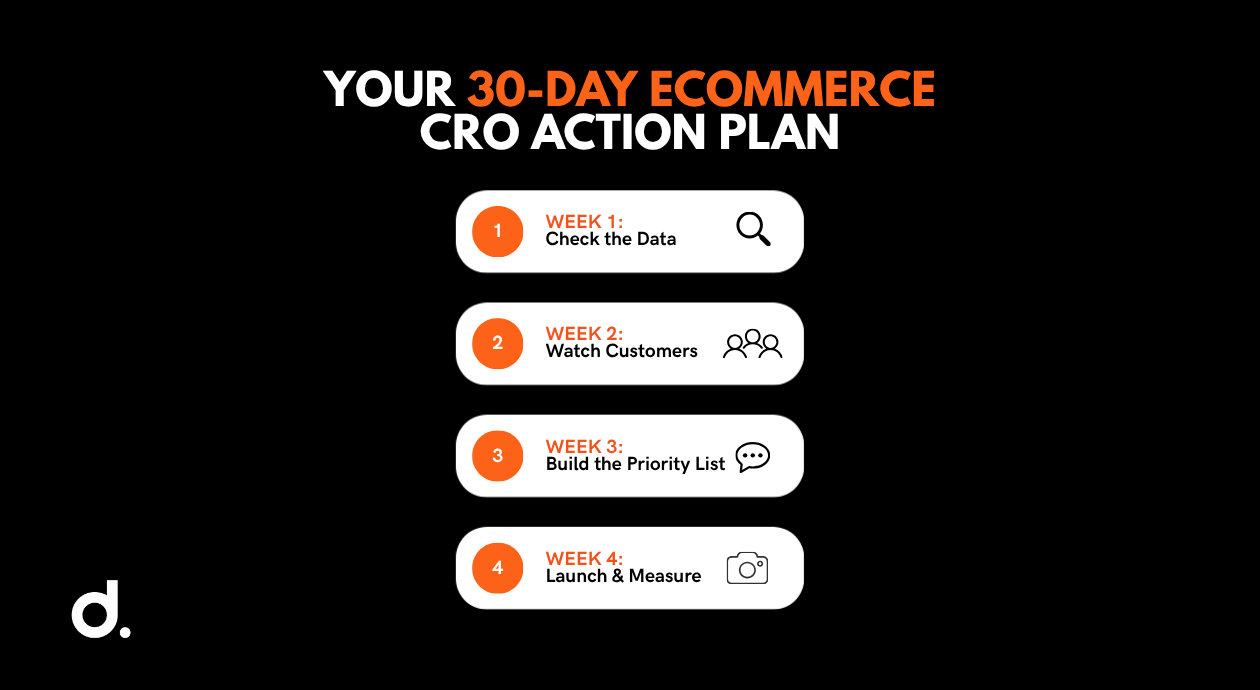
Your 30-Day Ecommerce CRO Action Plan
Week 1: Check the Data
- Confirm GA4 ecommerce events.
- Build the main funnel.
- Separate mobile and desktop.
- Review the last 90 days.
- Identify the largest unusual drop.
- Check tracking accuracy.
Week 2: Watch Customers
- Run five usability sessions.
- Review customer-service conversations.
- Read recent product reviews.
- Study return reasons.
- Review on-site searches.
- Document repeated problems.
Week 3: Build the Priority List
- Create a list of potential fixes.
- Estimate impact.
- Estimate effort.
- Place each item in the Impact/Effort Matrix.
- Choose one high-impact, low-effort change.
- Define the success metric.
Week 4: Launch and Measure
- Implement or test the change.
- Verify tracking.
- Monitor guardrail metrics.
- Record the result.
- Decide what the finding changes.
- Select the next improvement.
Do not begin with the longest checklist item.
Begin with the clearest problem.
Frequently Asked Questions
How can I increase my ecommerce conversion rate?
Start by tracking the full shopping funnel from product view to purchase. Find the stage with the most unusual drop-off, research why customers are leaving, then prioritize possible fixes using impact and effort. Common opportunities include clearer product information, better images, transparent delivery costs, guest checkout, fewer form fields, and faster mobile performance.
What is a good ecommerce conversion rate? What is a good ecommerce conversion rate?
There is no universal good rate. Conversion varies by product category, price, device, traffic source, market, and customer type. Statista reported a 1.4% average across selected verticals in the first quarter of 2026, but individual sectors in the same dataset ranged from 0.3% to 2.4%.
How do I calculate an ecommerce conversion rate?
Divide completed orders by total website visitors for the same period, then multiply by 100. If 30 customers purchase from 1,000 visitors, the conversion rate is 3%. You can also calculate product-view-to-cart, cart-to-checkout, and checkout-to-purchase rates to locate specific leaks.
What causes shopping cart abandonment?
Some shoppers are browsing and were not ready to buy. Preventable reasons include unexpected shipping or fees, slow delivery, a lack of trust, forced account creation, complicated checkout, website errors, unclear returns, and insufficient payment options.
Do I need enough traffic for A/B testing?
Yes. A valid A/B test needs enough visitors and conversions to identify a meaningful difference. The required sample depends on the existing conversion rate and expected improvement. Low-traffic stores can use usability testing, customer research, technical fixes, and well-supported UX practices instead of formally testing every change.
How many A/B tests should I run at once?
Avoid running overlapping experiments that affect the same page, audience, or conversion path unless the testing setup can account for the interaction. Stores with enough traffic may test separate areas simultaneously, but each experiment needs a clear hypothesis, audience, primary metric, and decision rule.
What should I optimize first?
Start with high-impact, low-effort problems supported by evidence. That might include displaying delivery costs sooner, offering guest checkout, fixing a broken mobile form, clarifying optional fields, improving the primary product image, or adding missing returns information. Use the Impact/Effort Matrix rather than choosing the most interesting idea.
Better CRO Starts With Better Priorities
The ecommerce stores that improve conversion fastest are not always the ones running the most tests.
They are the ones that understand what is blocking customers and choose the right problem to solve first.
Pull the last 90 days of data.
Map the journey from product view to purchase.
Speak to real customers.
Write down the three strongest improvement ideas.
Then place them inside the Impact/Effort Matrix.
Start with the change that has a credible chance of improving the buying experience without requiring months of work.
Digital Shaping helps ecommerce brands connect analytics, user behaviour, website experience, SEO, testing, and email automation into a practical conversion strategy.
A full CRO review can show where customers are leaving, which changes deserve priority, and how to turn more existing traffic into revenue.
One conversation, no pressure.